fig2
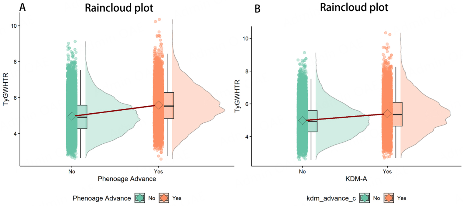
Figure 2. Differences in PhenoAgeAccel (A) and KDM biological age Accel (B) by TyG-WHtR, visualized using raincloud plots. Each plot combines a half-violin density, boxplot, overlaid raw data points, and a mean-connecting line to illustrate distributions and group comparisons.